64 Million Artists
64 Million Artists is a social enterprise dedicated to using creativity to spark positive change. Its annual January Challenge brings together musicians, artists, chefs, comedians, authors and more, to set daily creative challenges for participants and attendees. And this year, there was a wish to up the fun factor with a new advertising campaign identity.
With a strong track record supporting purposeful organisations on a pro-bono basis, the Hamilton-Brown team was delighted to pitch in. We needed to create a new visual identity, as well as supporting marketing assets that would bring an engaging, “festival” feel to the campaign – fitting for the 10th anniversary event.
Our solution
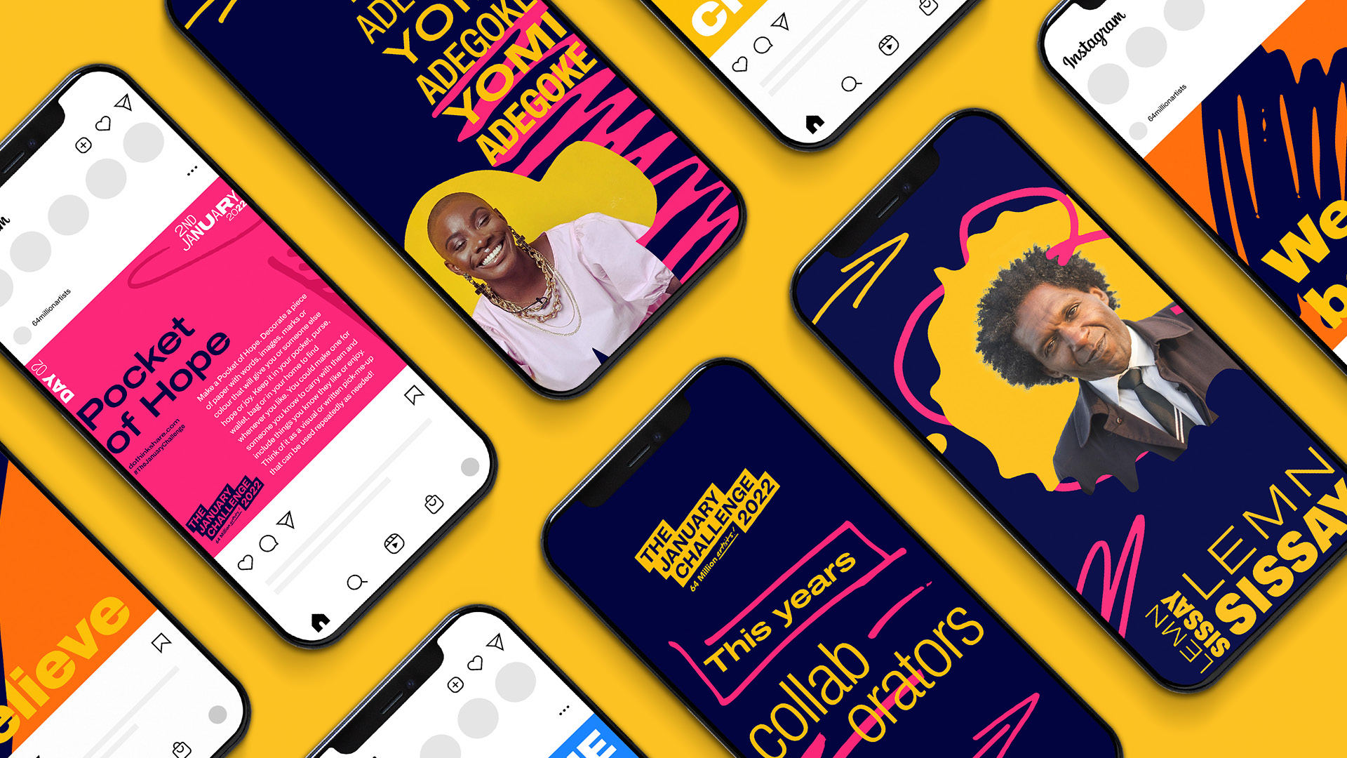
The client’s January Challenge is underpinned by the concepts of human interaction, and wide participation, no matter who the participants are. So, working with the 64 Million Artists team, we landed on a campaign theme of ‘The Marks We Make’ and celebrating the lasting impressions we create. To bring this idea to life, we created “marks” – which could be anything from a simple pen stroke or a fine art painting – using all different materials. We digitised these various ‘marks’ to inform the campaign’s look and feel, and incorporated them into the logo.
Social accessibility is key to 64 Million Artists’ vision, so we found a way to bring the same level of inclusivity to the campaign identity. And with a brief that required a bold, energetic feel, we had to approach colours and visuals with careful consideration. The colour palette we chose was selected with accessibility in mind, so even those participants with colour blindness would see the most vivid rendering possible.
Our delivery
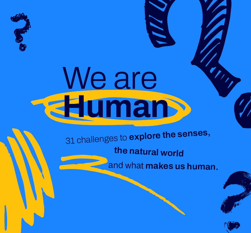
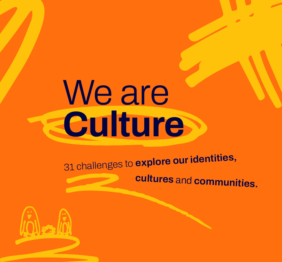
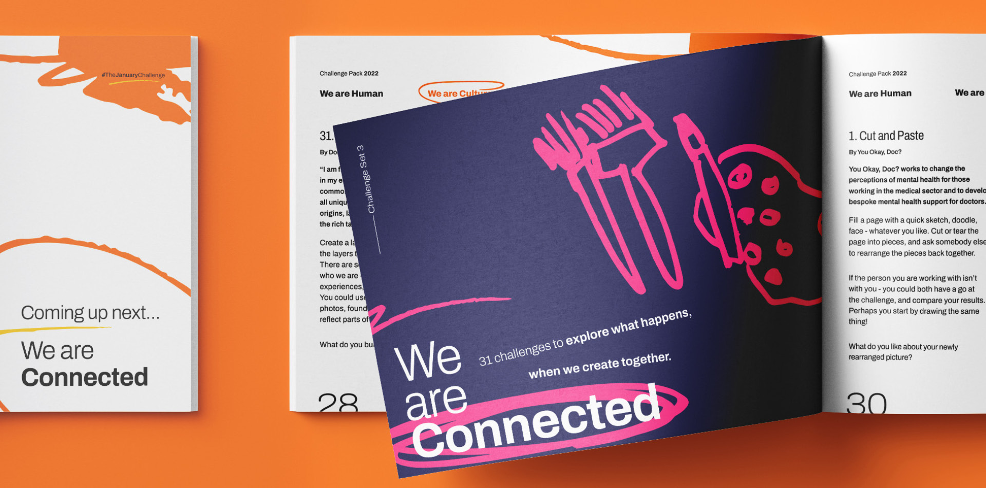
The challenges within the campaign fell into three categories, or ‘Pillars’: Humanity, Culture and Connection. To further boost accessibility, we created specific marks for each Pillar, as well as isolating specific colour pairings from the overall palette. This helped participants to identify their challenge and supported tailored marketing to address specific audience needs.
We brought extra depth to messaging through a variable use of typography that not only added a dash of versatility and engagement to the campaign but also reflected the ethos of the organisation: bringing all different people together. We carried this treatment through all the campaign assets, from single words with a sense of movement to words and sentences in different weights, all combined to add texture and impact.
Key deliverables:
Creative direction
Campaign identity
Bespoke illustrations
Social media templates