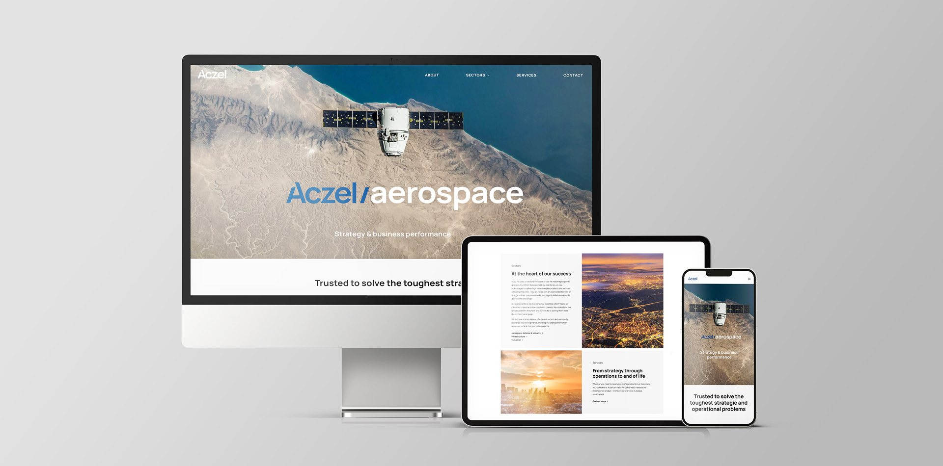
Specialist consultancy Aczel leads on strategy and performance enhancement within the aerospace, defence, and security industries. Its leadership felt that Aczel’s website lagged behind the firm’s cutting-edge approach and believed that the way the business was expressed and visualised was losing traction in its target market. Hamilton-Brown stepped in.
We were already engaged on a wider rebrand project for Aczel, so we added a new website to our to-do list. Alongside bringing the visuals in line with the firm’s reimagined identity, we needed to rethink the user experience from end to end.
The challenge
The website work needed to align seamlessly with the ongoing rebranding project, to enable a holistic new identity across Aczel’s touchpoints. The website itself demanded a clean, more current feel that would act as a showcase for the new brand. We determined that the site structure and user experience would have to be completely overhauled to better guide users through Aczel’s offering, reinforcing the brand messaging and key USPs.
Our solution
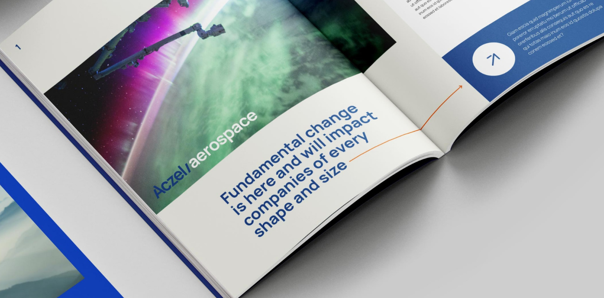
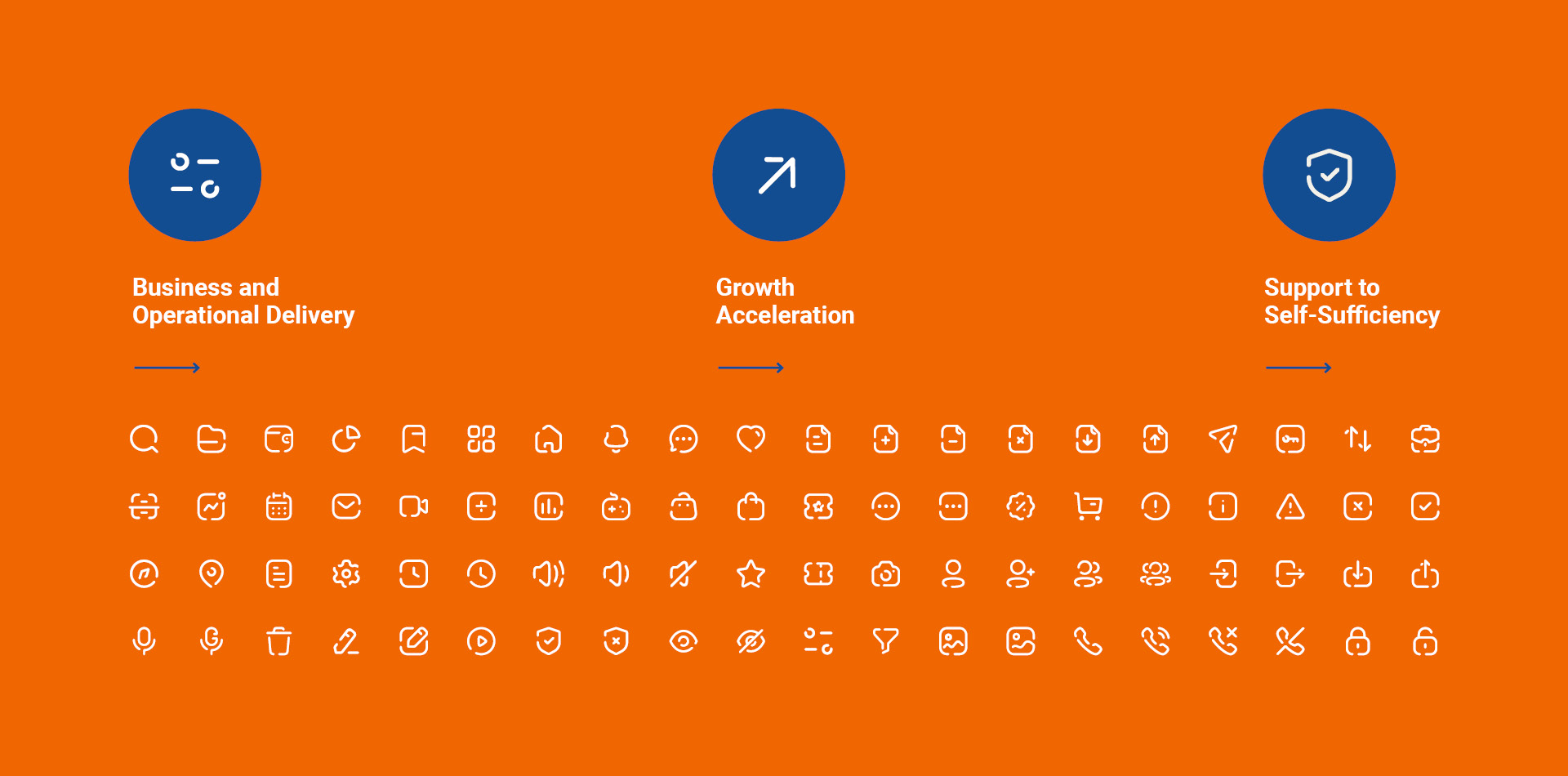
Our creative teams got to work, designing and developing a new brand identity and website. The new design system introduced a fresh, eye-catching approach through bolder colours and typefaces.
We reconfigured elements of the brand to help Aczel to deliver substance and storytelling across its multiple channels: the aim of our approach was to celebrate Aczel’s standout services through unique shapes, bold colours, and distinctive photographic styling.
We designed and built a new website for Aczel, applying the visual identity that we had defined in the rebrand project to the overall user experience. The result of both efforts champions the bold photographic elements and accents of colour that we used across Aczel’s other collateral as part of a carefully considered and easy to navigate website.
Key deliverables:
Brand identity
Art direction
Web development
Marketing asset development


