For one of HB’s global professional services clients, we designed a proposal campaign for its target client, which we called ‘ArcLight’ (not the client’s real name). This target was a leader in the software and analytics space and offered its customers a smart proposition: an integration platform that leveraged the power of SAP to enhance business analytics and process automation. But to showcase the tool’s full potential, we believed ArcLight had to tackle what appeared to be an identity crisis.
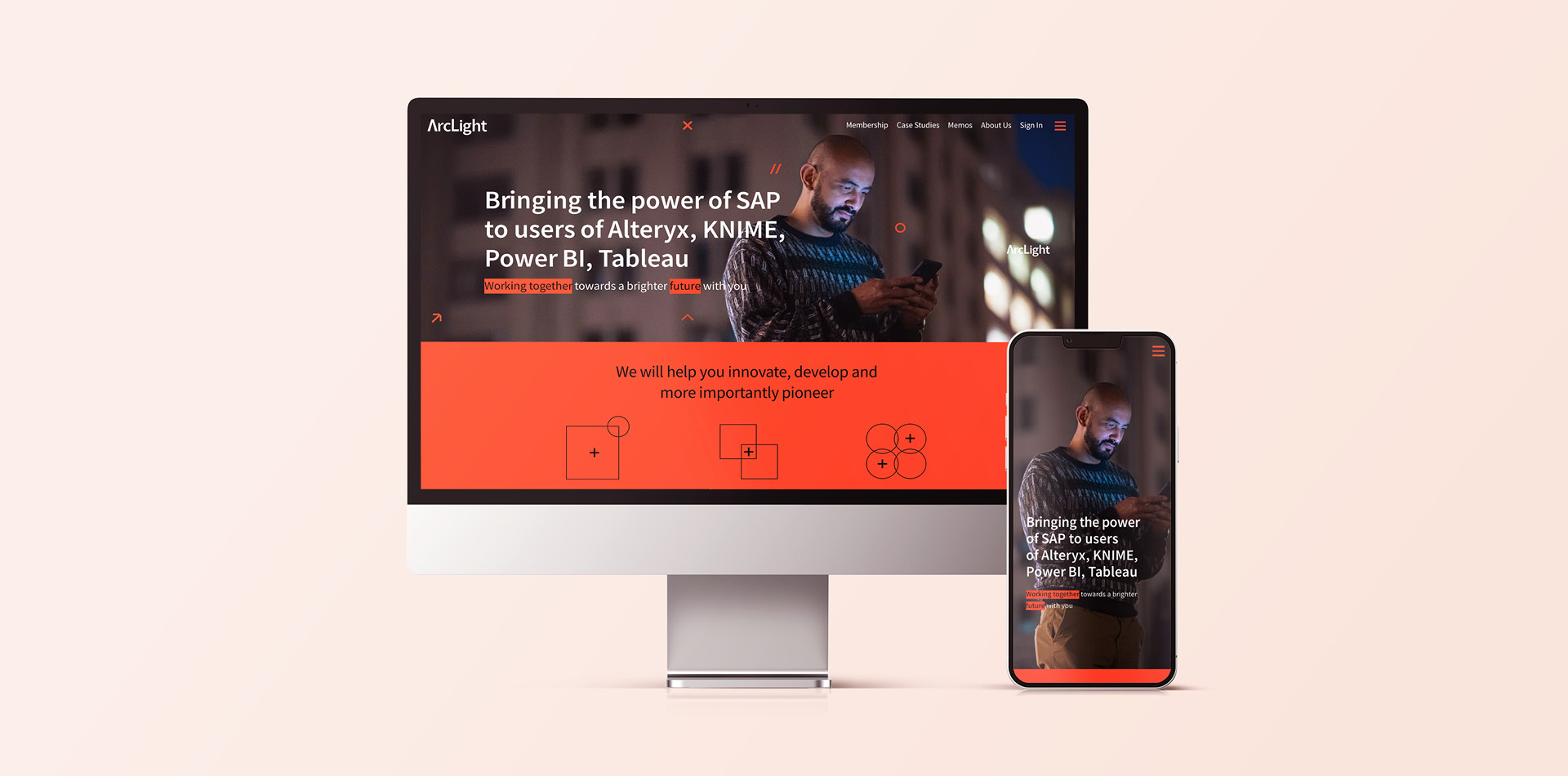
Hamilton-Brown saw that ArcLight’s visual language needed to be revamped: specifically the look and feel of it, to better appeal to a tech-savvy audience while also bringing clarity to what appeared to be a complex offering. Our strategy would need to flex across a range of the firm’s collateral and channels, encompassing a wide toolkit that would enable ArcLight to take its new identity forward.
The challenge
We learned that positioning the platform effectively had proven problematic for many years, with the benefits often obscured by technical jargon, acronyms, and complex processes. Our challenge was three-fold. First, to create an identity that highlighted the transformational potential of the tool on a functional level. Second, to showcase the strength and agility of the data. And finally, to convince its customers across business sectors of the positive impact the analytics could have.
In the words of our client, ArcLight needed an identity that would “appeal to a modern, younger market. A way to highlight our strength by being technologically, as well as visually, set the firm apart from our competition.” Our competitor research revealed a few recurring themes, some of which could be seen as out-dated and misaligned with the wider business narrative. Everyone agreed: it was time to shake things up.
Our solution
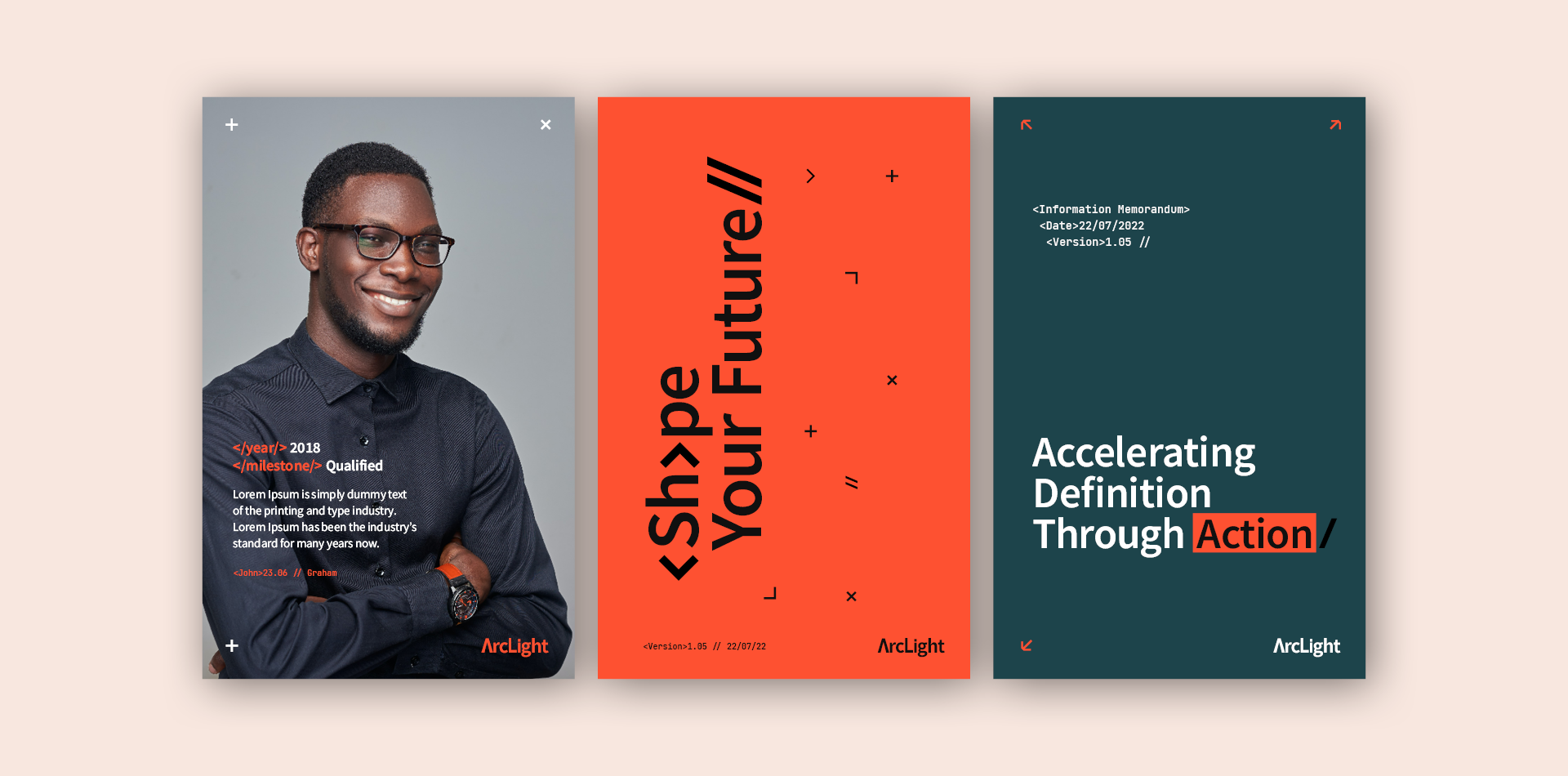
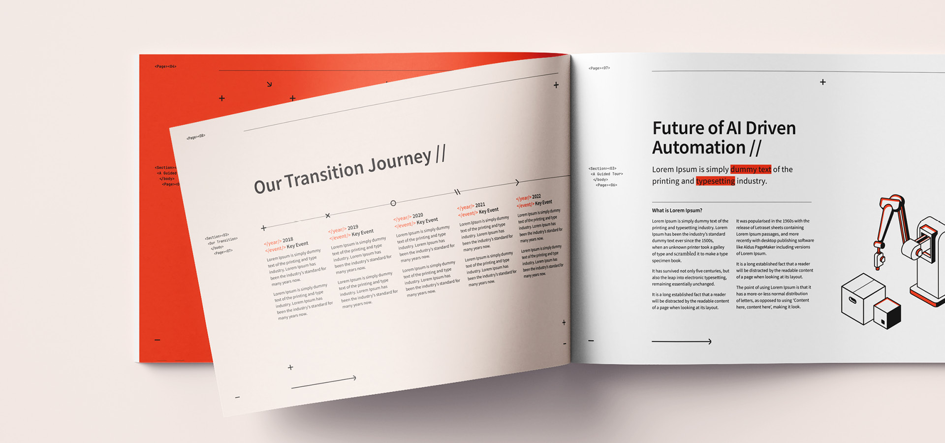
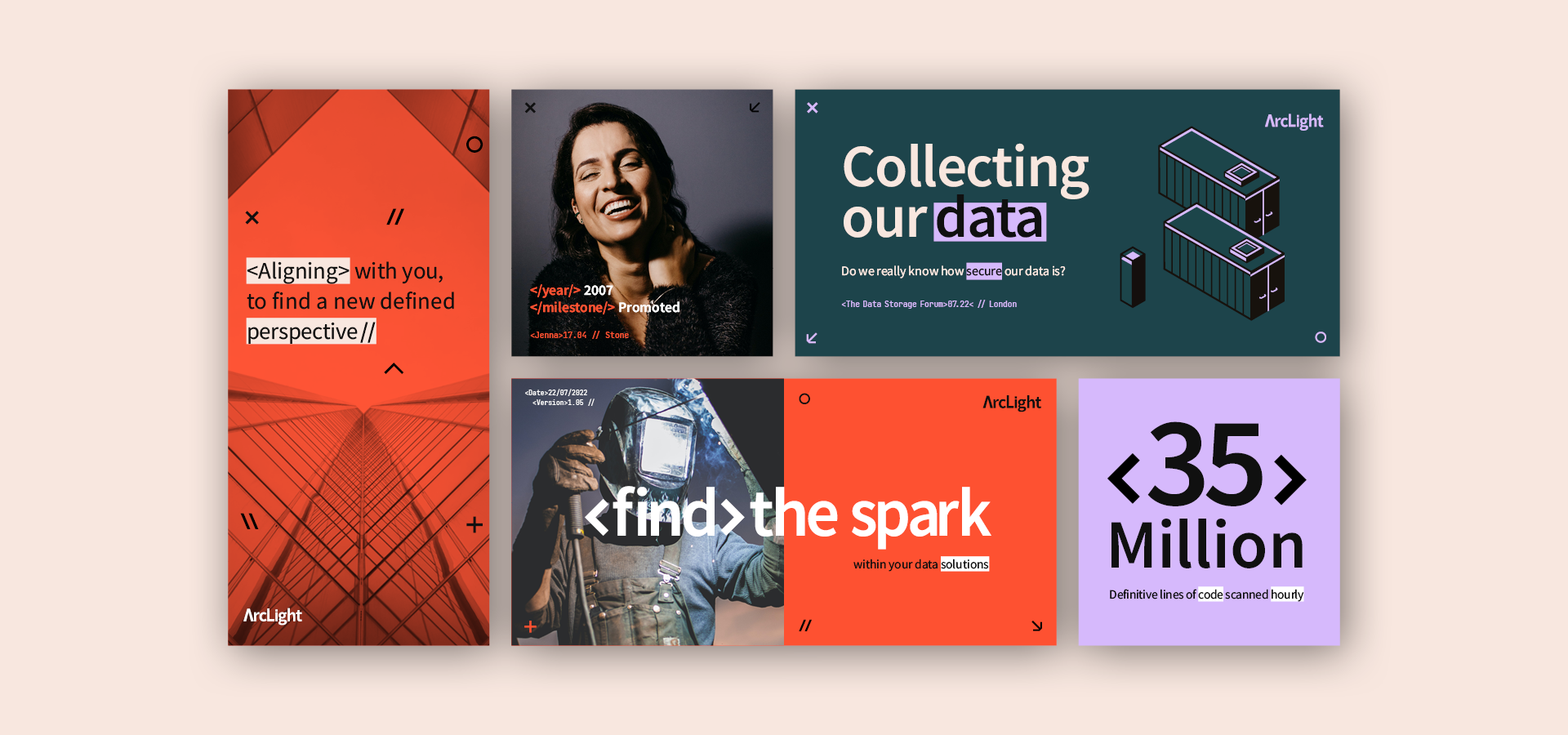
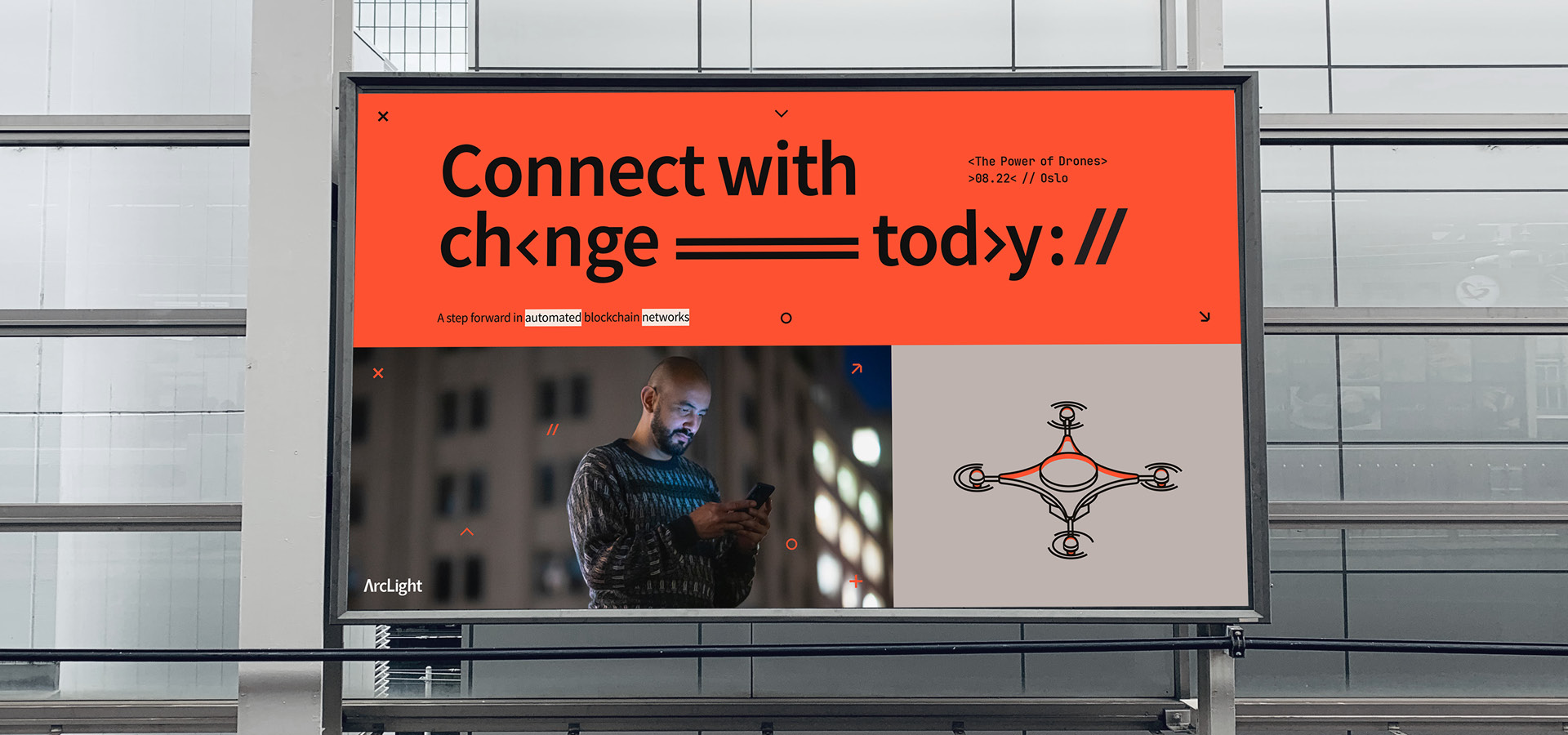
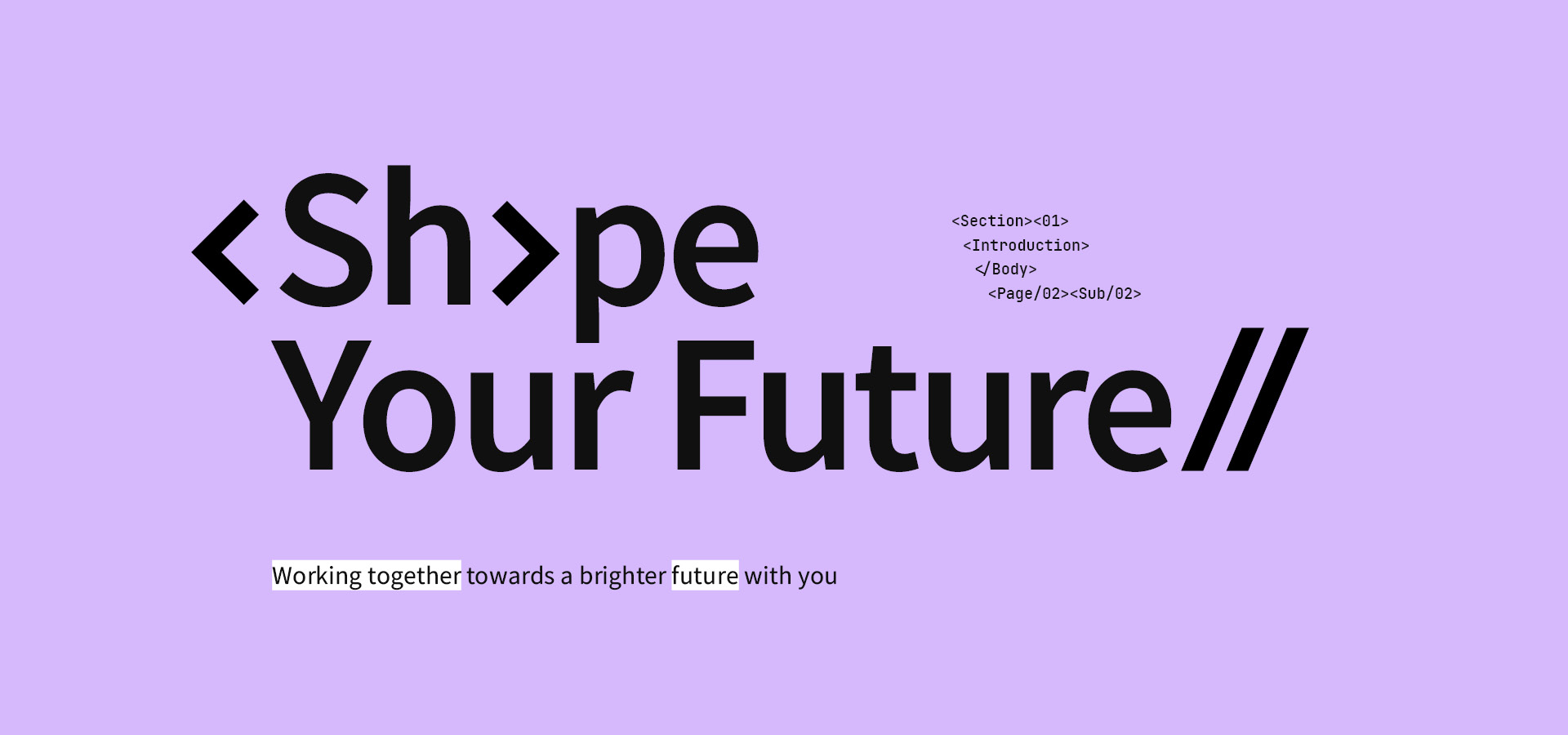
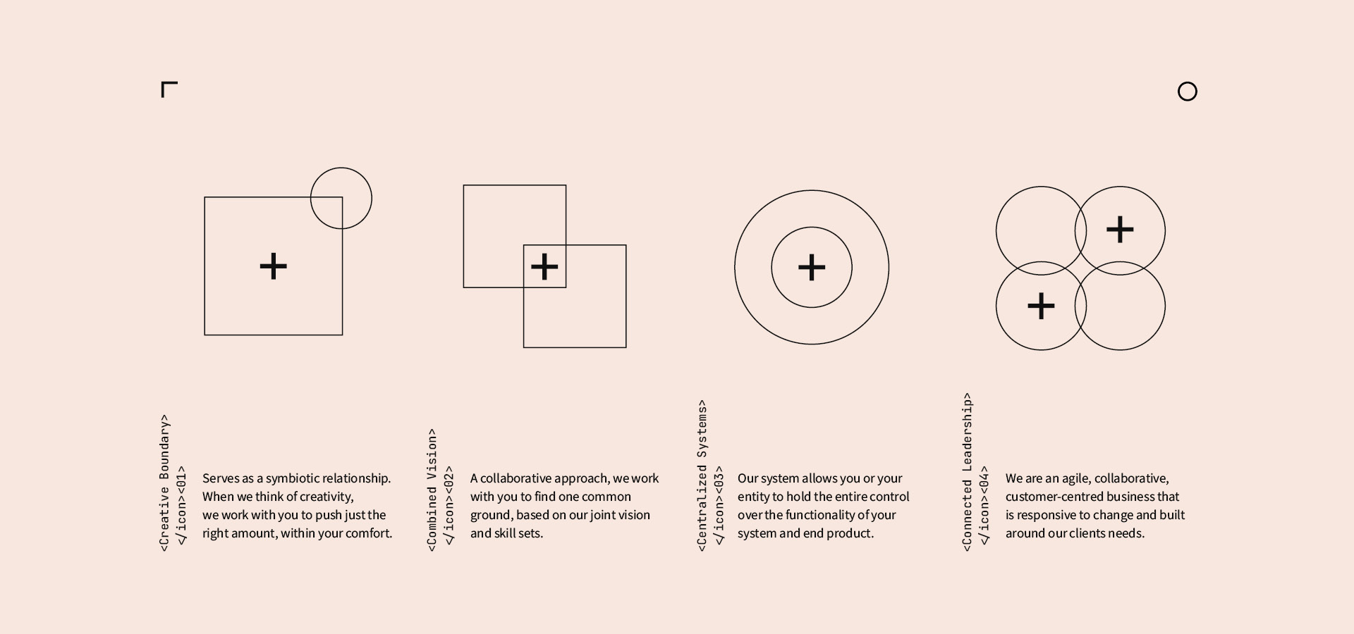
The driving force behind the solution was its code: we wanted to make its code integral to the visual identity. Just like ArcLight’s platform, the idea of HTML code formed the backbone of our campaign, through three themes: scanning, processing, and structure. This analytical concept was given greater depth through abstract geometrics that work in partnership with colour and photography. Where photographic images would struggle to convey complex theories and ways of work, we aimed to deploy a clean, illustrative style.
Existing brand colours were changed to be more vibrant for a contemporary feel. We paired a minimal, sans serif type with a monotype to support our future-facing identity, while the addition of code-based glyphs in Hero messaging tied back to the overarching HTML code theme and added an element of surprise.
Bringing pieces together into a single visual toolkit supported a breadth of messaging and collateral and we reshaped everything from reports and event assets to social media and microsites. Meanwhile, a collection of templates enabled ArcLight to continue creating a wide range of day-to-day assets in-house.
Key deliverables:
Creative direction
Brand strategy
Web design
Marketing materials
