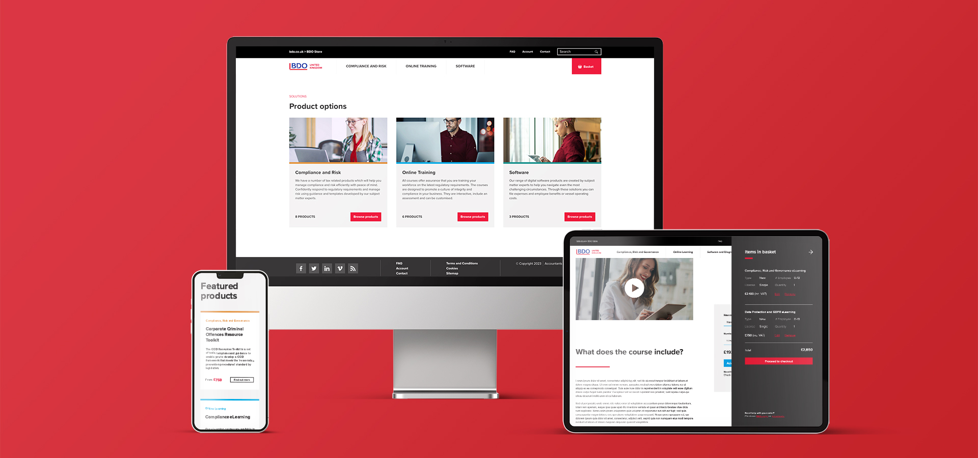
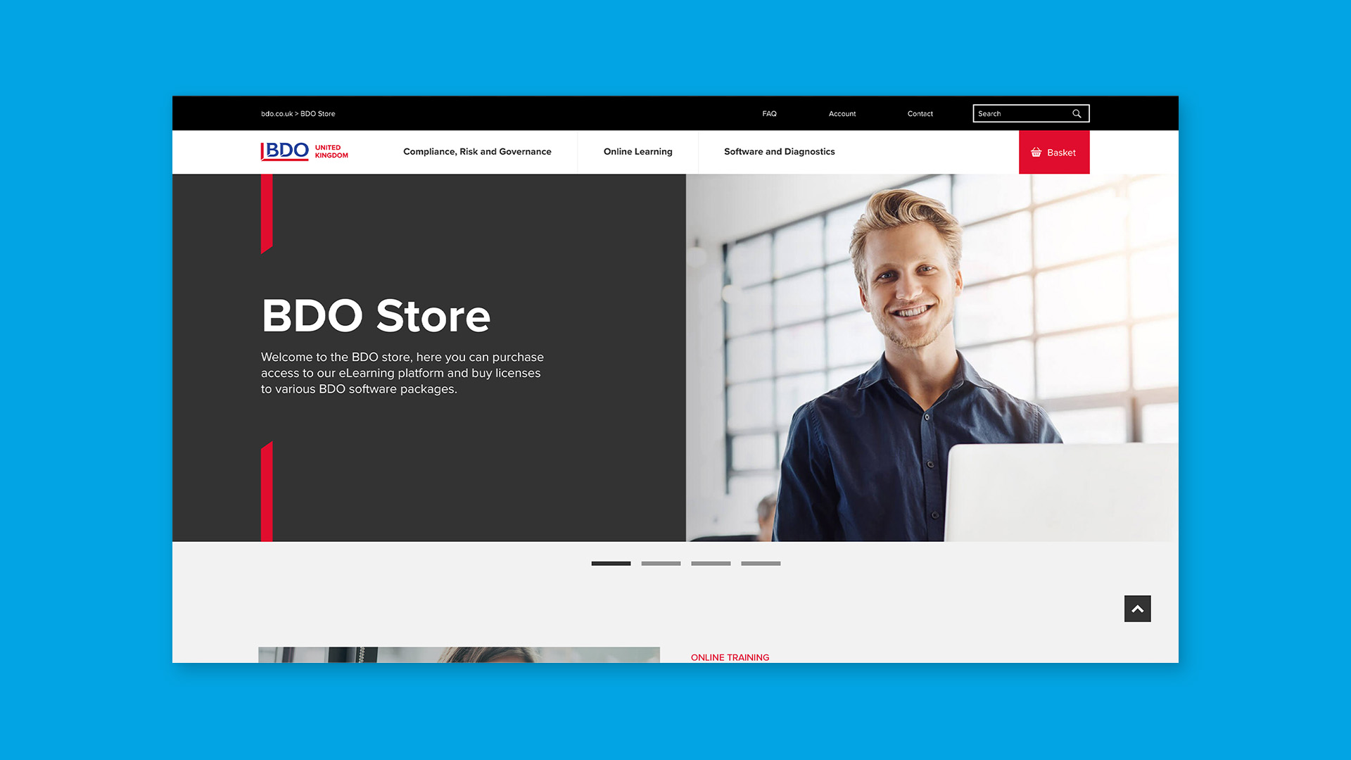
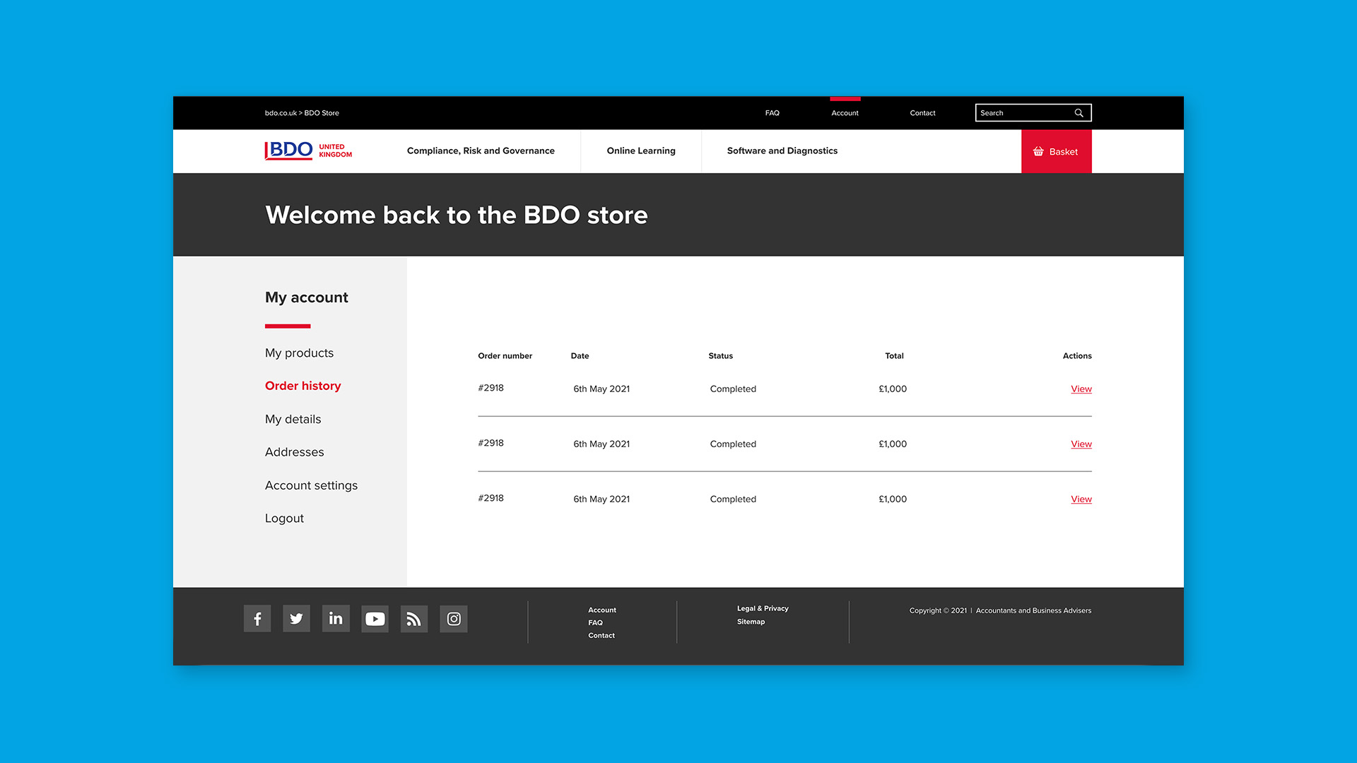
BDO, a leading accountancy and business advisory firm, has an e-commerce arm, ‘BDO Store’, that offers expert training courses and online toolkits. Senior Management wanted to overhaul the look, feel and function of BDO’s Store, and turned to Hamilton-Brown. As BDO’s long-standing creative partner, our teams were up for the challenge.
Together, we needed to re-think the user’s journey from the bottom up, considering how products were categorised and identified. The business already had a strong visual language, but our Creative Designers wanted to improve it for the e-commerce platform and its target market. It would take a holistic approach, encompassing everything from format to functionality – all wrapped up in the BDO identity.
The challenge
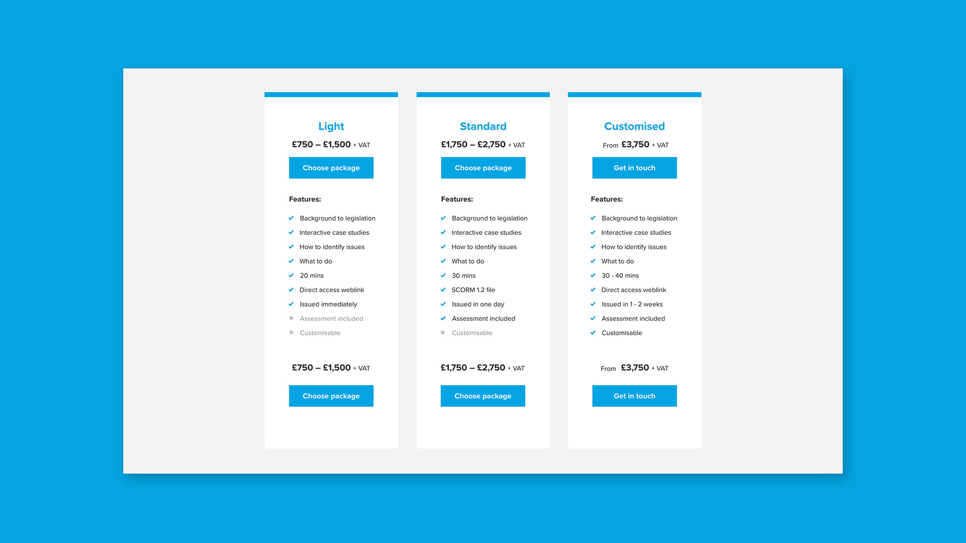
The existing user experience was somewhat unclear. Products were not optimally organised and therefore it wasn’t always clear which solutions were delivered. We re-visited the user journey with the aim of making it more concise. We also sought to understand the way products were described and introduce new functionality to drive conversions.
In making these and any other changes, we had to be mindful of BDO’s existing visual language – which was carried comprehensively across all its touchpoints, including the Group-level site. The new Store needed to retain the essence of BDO’s identity while more effectively reflecting the BDO Store’s e-commerce orientation.
Our solution
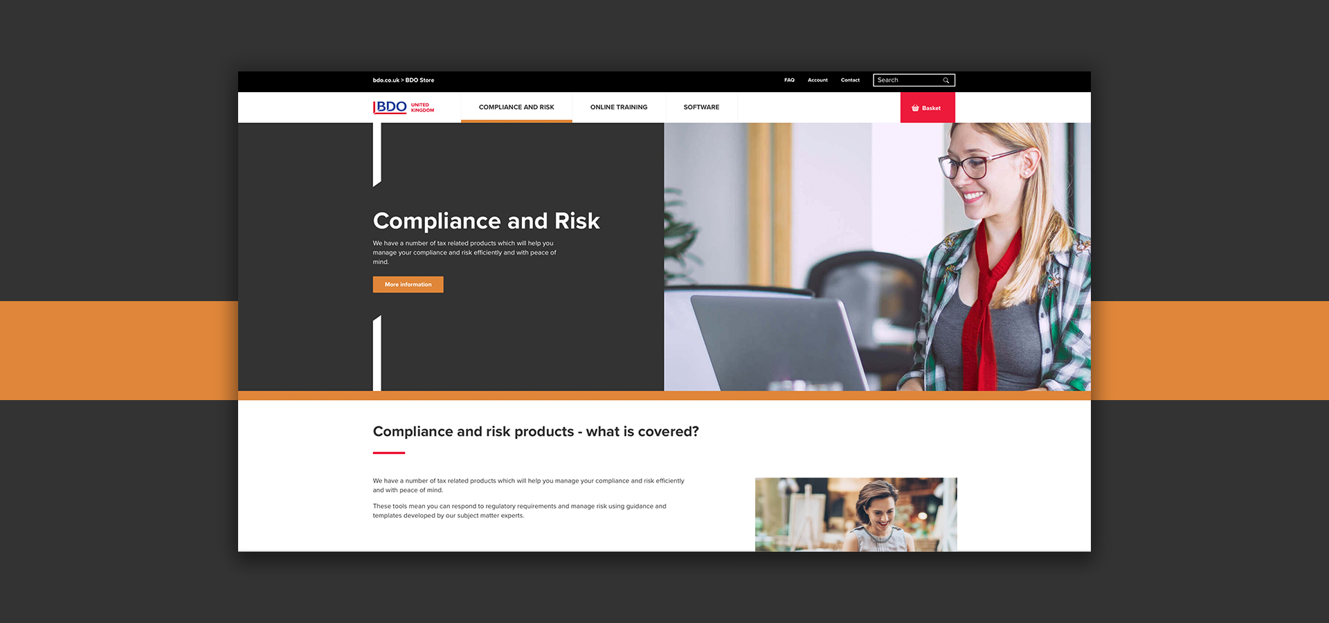
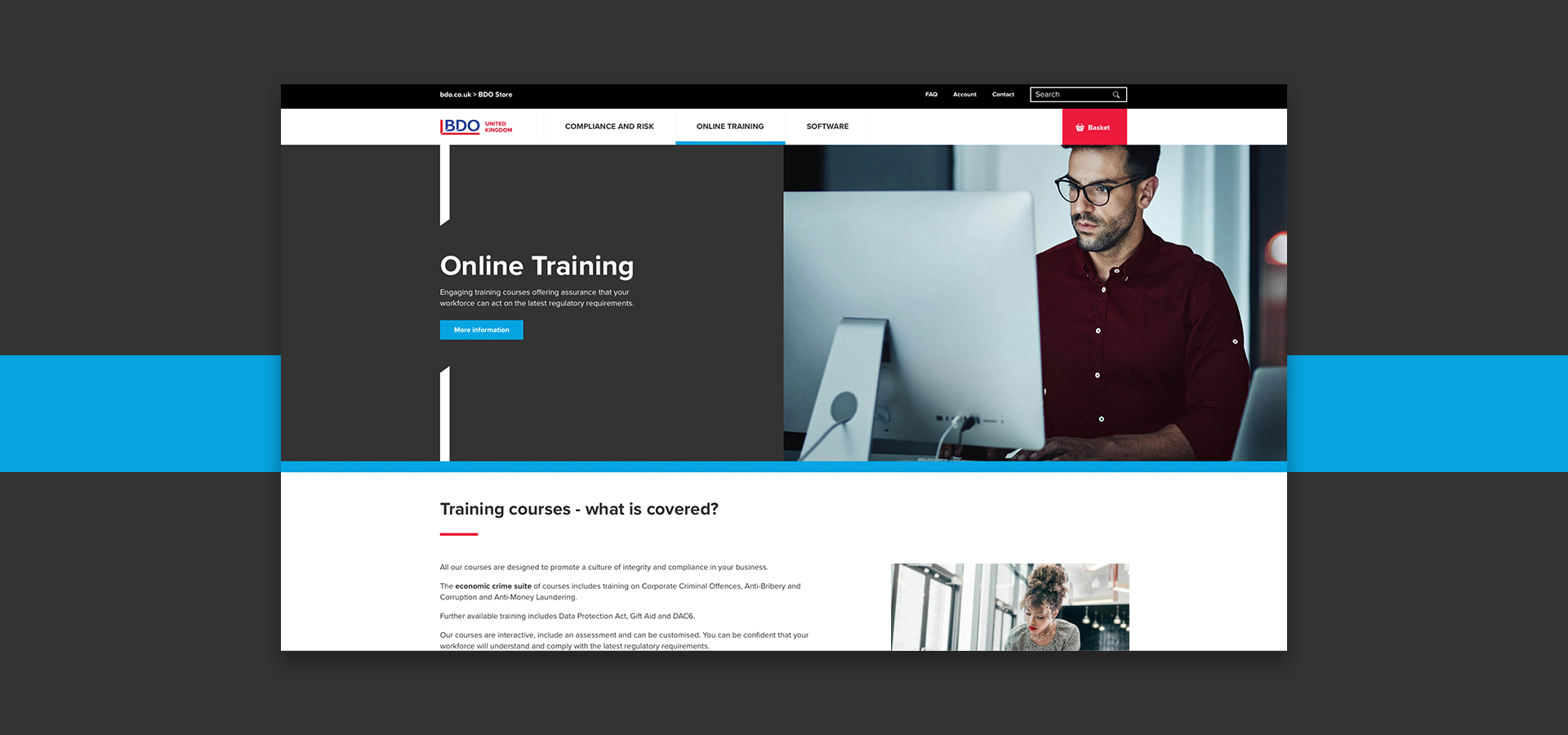
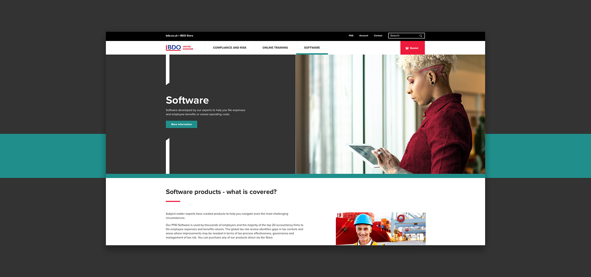
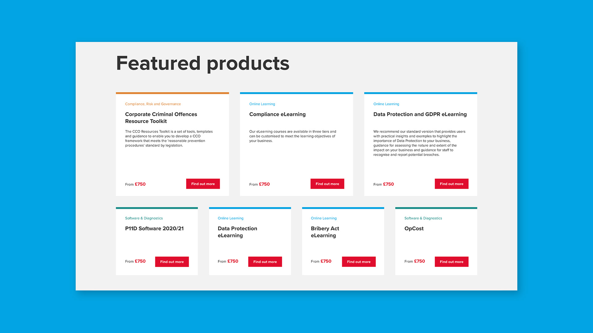
Working with the BDO digital team, we first re-shaped the way products are described and then mapped them to one of three Service “Pillars”. Each Service Pillar was given its own page, with relevant products clearly displayed, directing users to a defined product page. To further streamline the user’s journey, the Service Pillars were colour coded, with the colour scheme carried through to the corresponding product page.
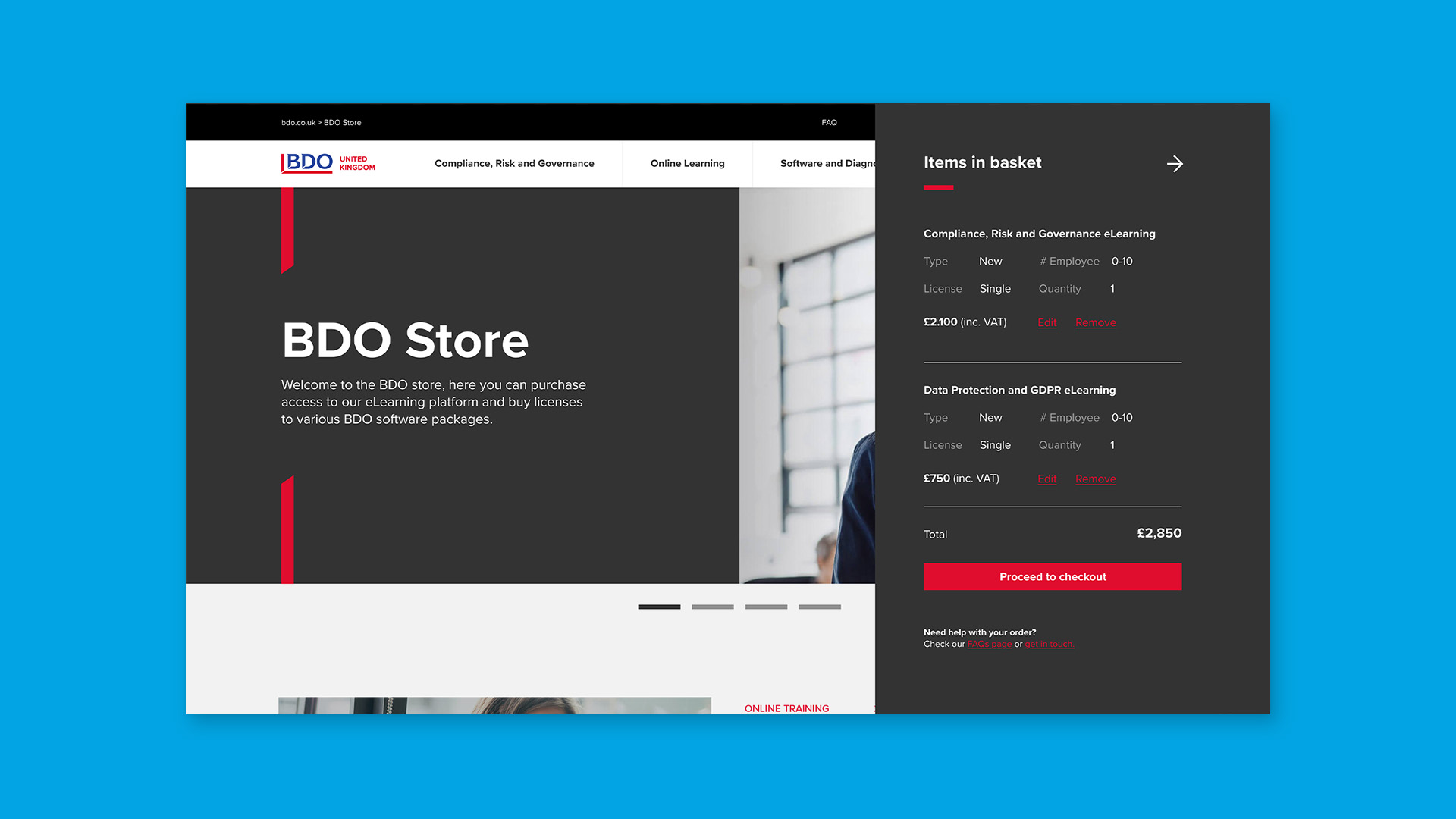
We then designed distinct purchase prompts throughout and developed an “add to basket” component for product pages that travels with users as they scroll. This ensures basket items are kept in view so that users can edit or add items as they go, and check out at any point, eliminating the need to scroll to the top or bottom of the page to find the “add to basket” button.
Working tightly within the framework of the BDO brand, we flexed the visual language by creating new custom themes and page-building functionality. A considered use of colour aided way-finding, with consistent graphic elements and a more minimalist, typographic approach to create a homogeneous user experience.
Key deliverables:
Wireframing
UX & UI
Content managed website build
E-commerce
