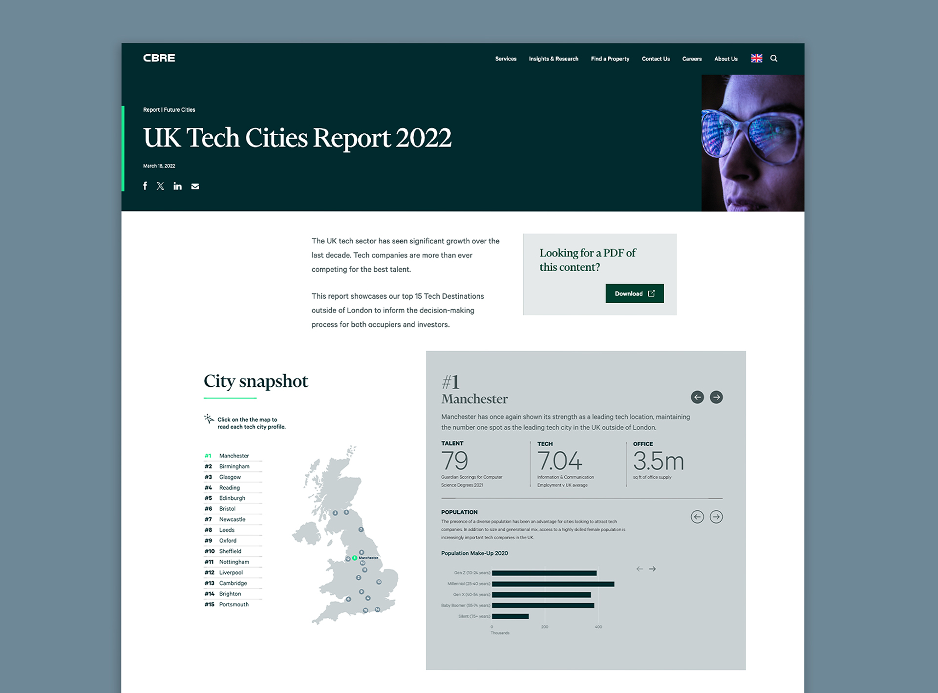
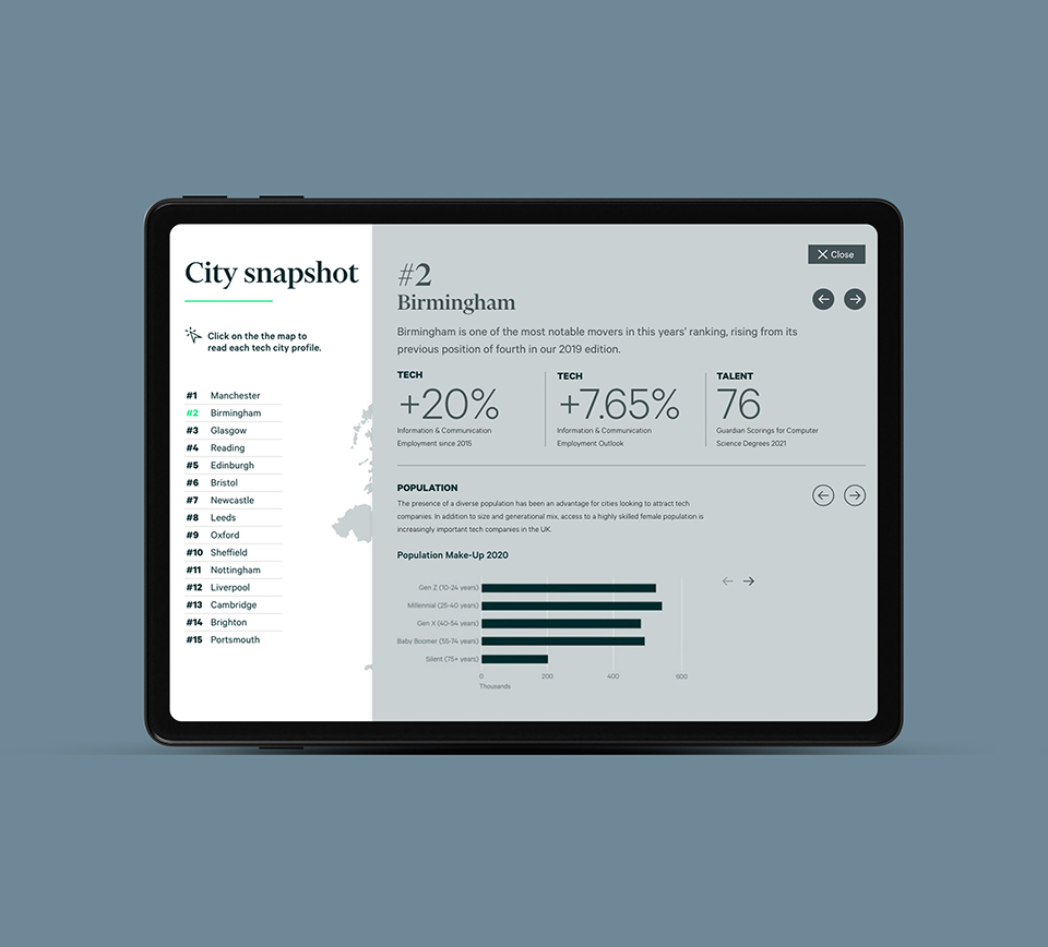
As a global leader in commercial real estate space, CBRE produce detailed reports that include complex data that they need to communicate effectively to their audience. CBRE asked Hamilton-Brown to adapt the details of their Tech Cities report into an interactive infographic that they could host on their corporate website.
The challenge
Like many large content-managed websites, the CBRE website lacked the built-in tools to create engaging infographics and interactive diagrams. This meant presenting the report in its original format would have resulted in a lengthy, repetitive, and ultimately unengaging experience for users.
Our solution
We designed an interactive dashboard that simplifies information beautifully. The user can navigate insights seamlessly through an intuitive interface, making complex data easily digestible.
To bring the data to life, we introduced an interactive map to navigate the data. This not only expands the information presented but also boosts engagement by encouraging users to interact with the content.
We leverage Ceros, a no-code platform, to seamlessly integrate the dashboard into the CBRE website, making it feel like a natural extension. Updates are easy with Ceros’ dynamic content capabilities, ensuring everyone has access to the latest information instantly.
Ceros also provides robust analytics tracking. We gain valuable insights into how users interact with the report, allowing us to optimise future projects and deliver even more engaging experiences.
Key deliverables:
Ceros
UX/UI design
Responsive design


