Global consulting firm Lionpoint had been working on a new brand identity across multiple teams and markets. Hamilton-Brown was asked to step in to help shift the work-in-progress into a clear new identity that aligned with Lionpoint’s strategic goals and vision.
We supported the client to rebuild from the beginning, bringing increased clarity and rationale back to the brand’s identity, while ensuring diverse Lionpoint teams were engaged with the process and proud of the results.
The challenge
We aimed to bring an objective view to the branding project, and so suggested returning to the beginning. We conducted an audit of the visual identity across existing collateral, to create a fresh and robust design system. Lionpoint’s core strategic pillars of ‘Professional, Innovative, Industry experts’ were the basis of our design, along with the legacy logo system that formed the foundations of the new system and its visual assets.
Our solution
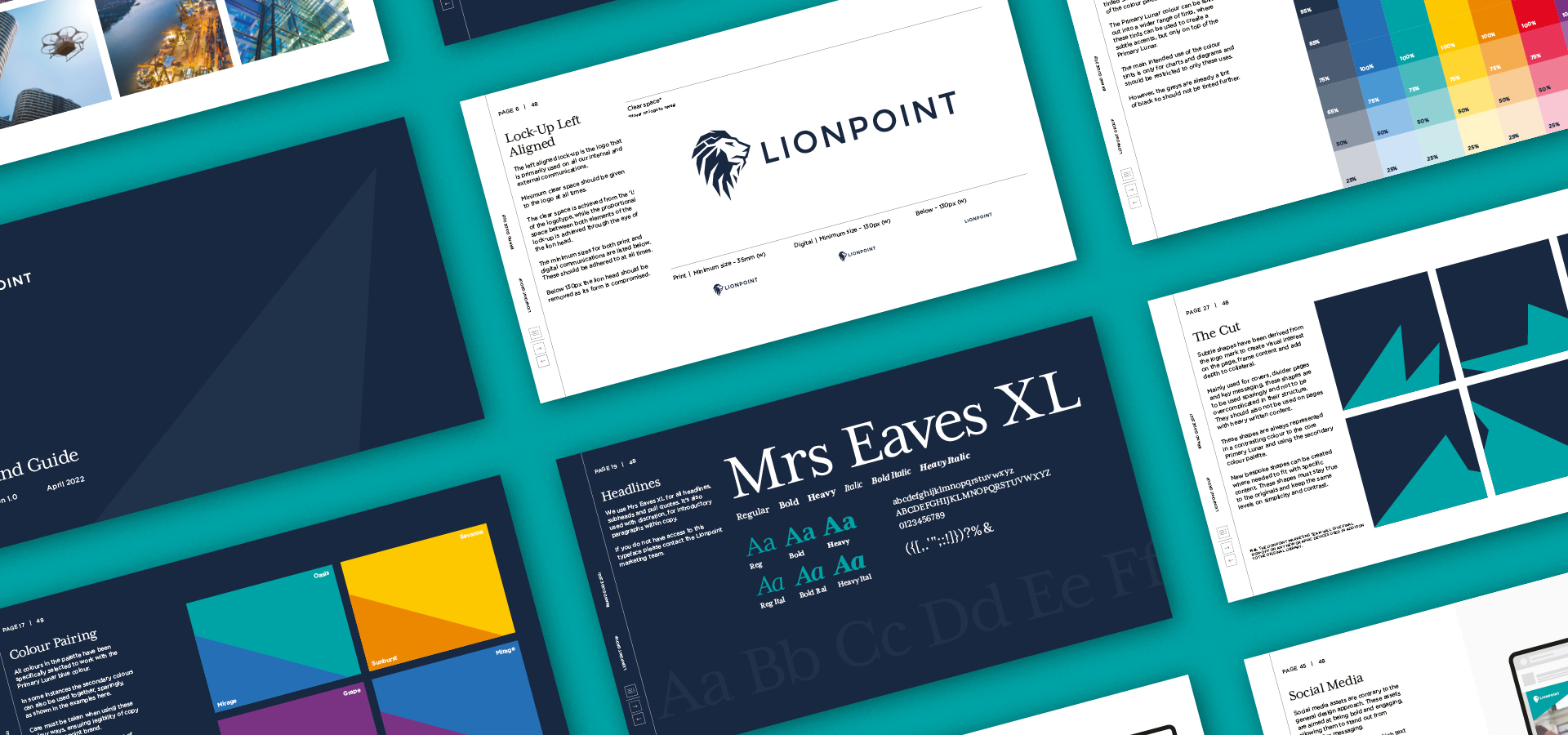
Working with Lionpoint’s existing lion logo, we derived our main overarching visual asset from specific points within the lion’s head. The Lionpoint teams agreed that this added a level of excitement and flexibility across all collateral. The Cut, as we called our graphic device, works with content and imagery to guide the user through the journey of information, framing the story and providing topical focal points.
We created a suite of bespoke icons to sit seamlessly alongside the main visual language. These icons, designed to work with specific services, were used sparingly in collateral to describe complex levels of information, but only where needed.
A new typeface was selected to better pair with the lion head emblem and the subtle nuances that came with the sharper edges and cuts. With this, a new typographical hierarchy was developed to add clarity to top-level messaging and core instructional content. The existing typeface, Gotham, was already well established as a secondary font, so we ensured this was still complementary overall, limiting potential technical upheaval with internal processes and systems.
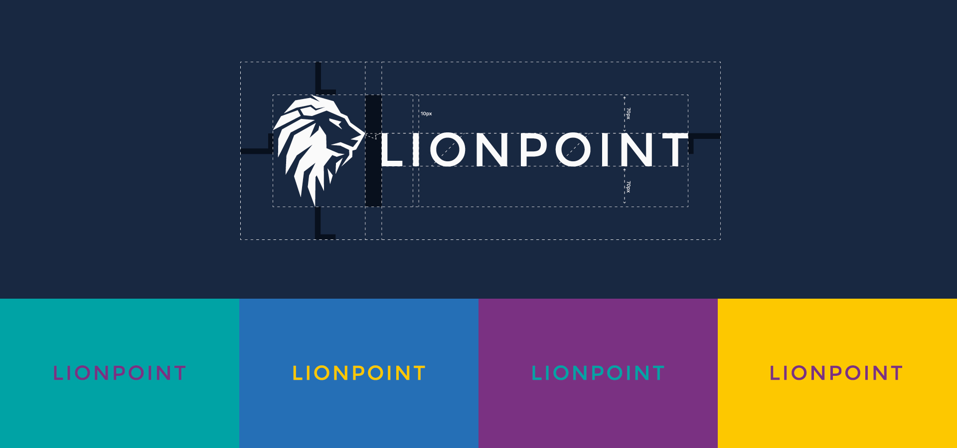
The Hamilton-Brown team noted that the original colour palette was similar to that of multiple organisations in that market, so the client agreed to us shifting it to a primarily blue palette, followed by a more vibrant secondary palette that formed the basis of the visual hierarchy.
Key deliverables:
Creative direction
Brand guidelines
Brand activation


