Sera Global, a leading global real assets private markets advisor, operates in a crowded sector with limited diversity in terms of branding. To better stand out from the competition, Sera Global decided to re-visit its visual identity and turned to Hamilton-Brown for help.
While Sera Global wanted a rethink and a refresh for its brand, the firm wanted to stick closely to the two blues from its existing identity and to retain its logo. Whatever we created would need to work across a wide range of communication channels and to support the Sera teams with the tools to take the new identity forward consistently and coherently.
The challenge
Along with the request not to deviate from the existing brand’s blues and logo, there were also limitations on imagery to consider: the firm wished to use photography to focus on team members, as well as employ a number of real-world scenarios it had in its recent archives. While there were undoubtedly some visual challenges to overcome, our market and competitor research revealed some promising opportunities.
Most of the design systems – and their overarching look and feel – employed by competitor brands in Sera Global’s sector relied on flat blues and greys, coupled with non-descript imagery. This presented an opportunity for us to challenge the client’s thinking and earn their confidence to inject more “personality” into Sera Global’s brand.
Our solution
We leveraged Sera Global’s strapline ‘Beyond the Transaction’ to develop a new, flexible graphic device – dubbed ‘The Beyond’. Derived from the existing logo, the device is a reference to the client’s key business directive: to go the extra mile and take clients to new places.
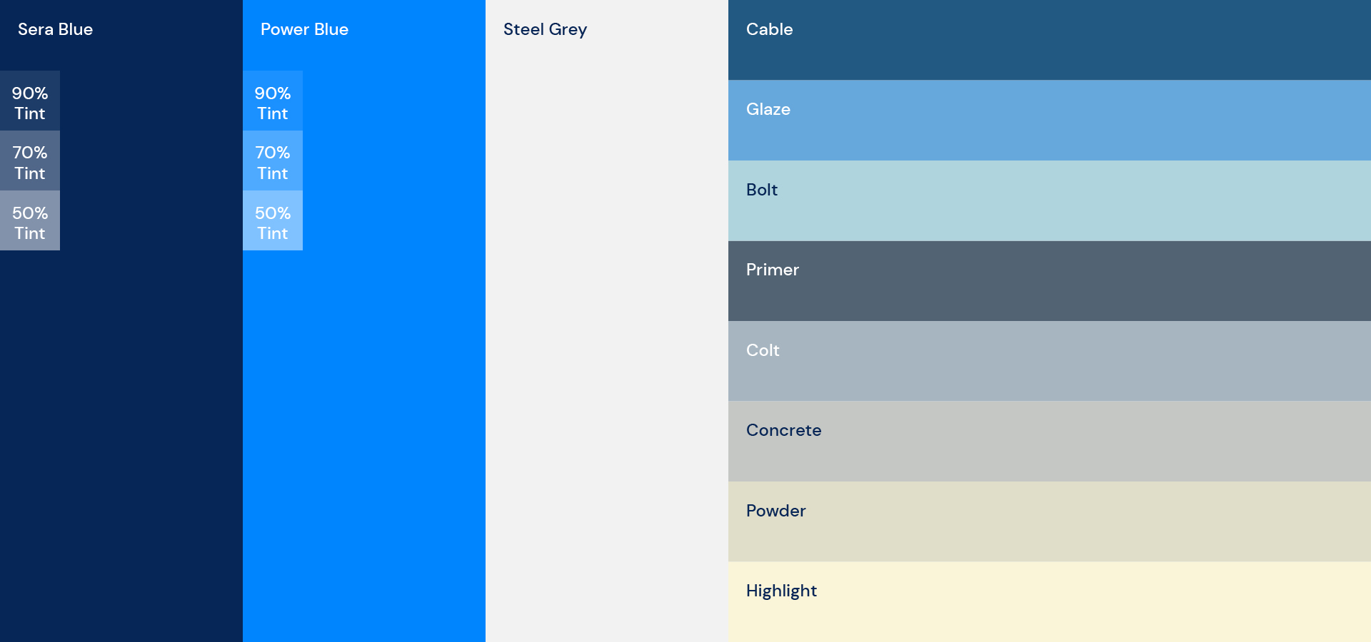
To complement the momentum created by this graphic device, we did make minor modifications to the two core Sera Global blues, which resulted in more contemporary, energetic hues and still retained the brand’s core identity. We also defined a secondary palette of complimentary colours inspired by the three specialist advisory services: Real Estate, Infrastructure with Renewables, and Sustainability.
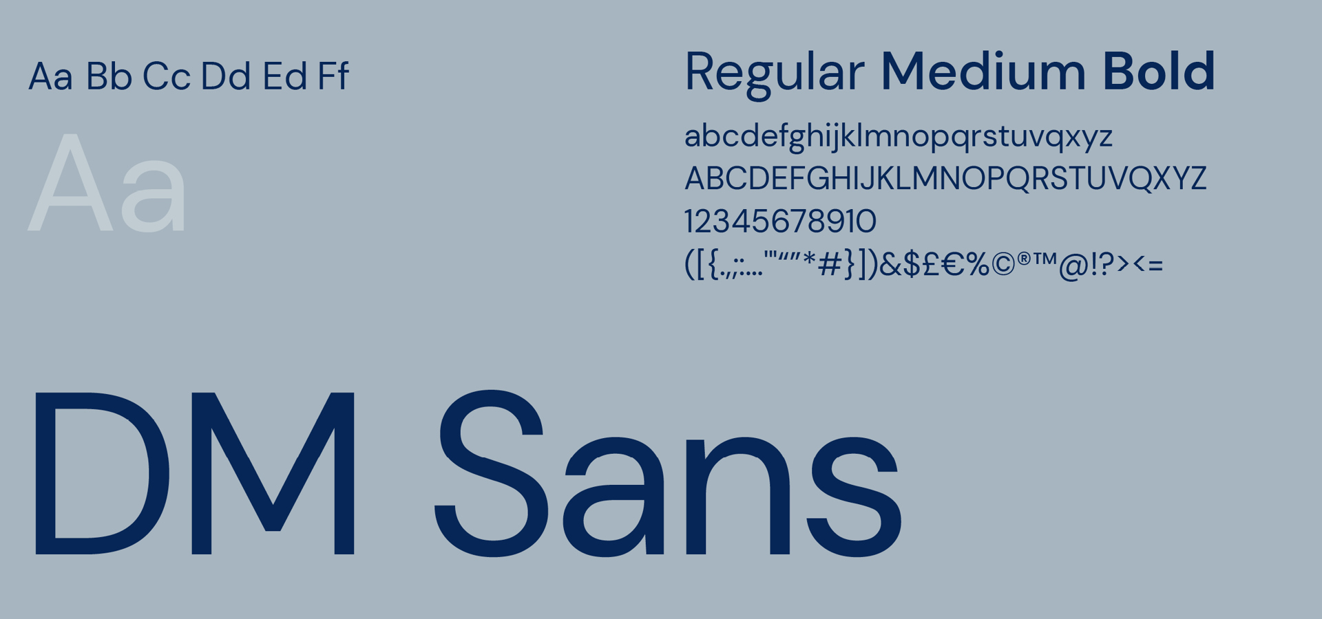
We selected the flared-serif typeface Marcellous, to convey professionalism coupled with the contrasting geometrics of DM Sans to create a forward-facing pairing.
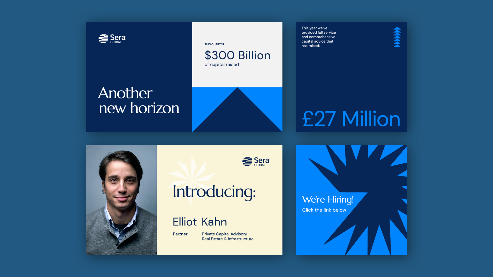
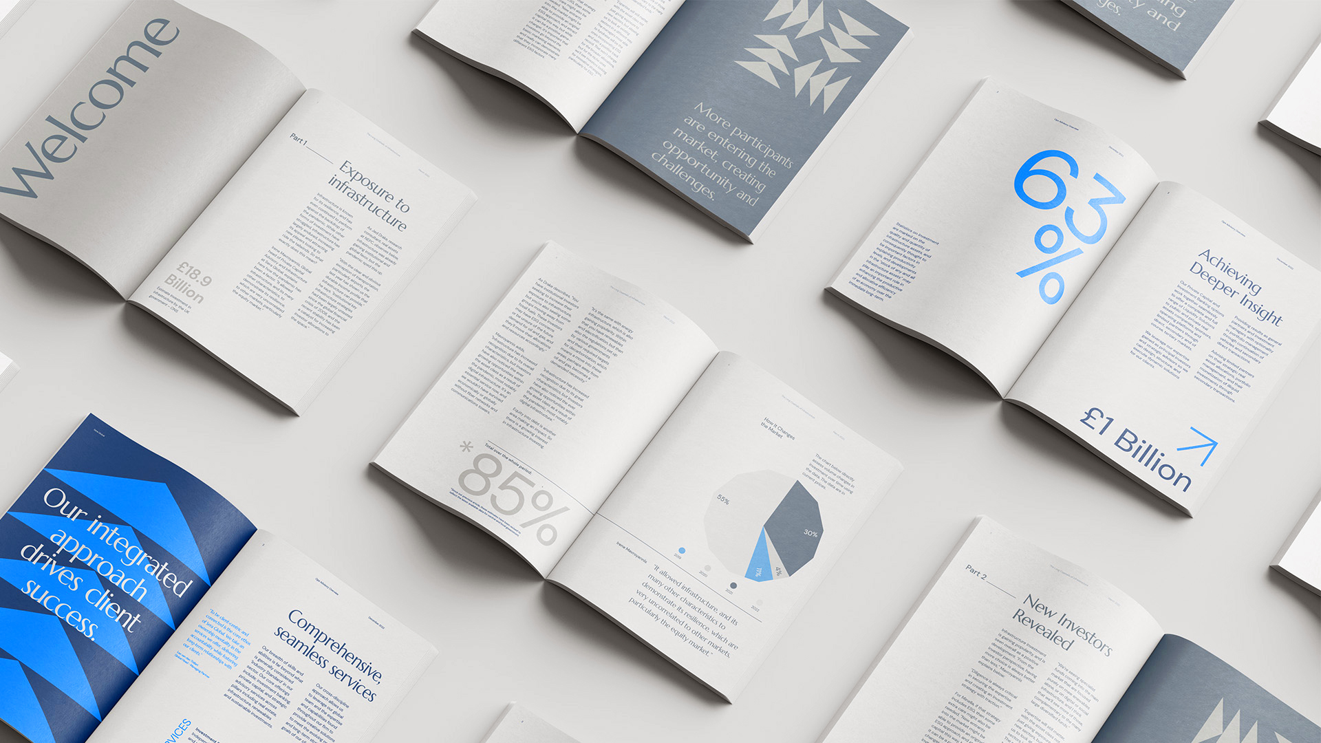
Once we had developed the new look and feel, we set about applying it across existing and new Sera Global communications, ranging from marketing collateral and reporting to presentations, social media assets, and event collateral.
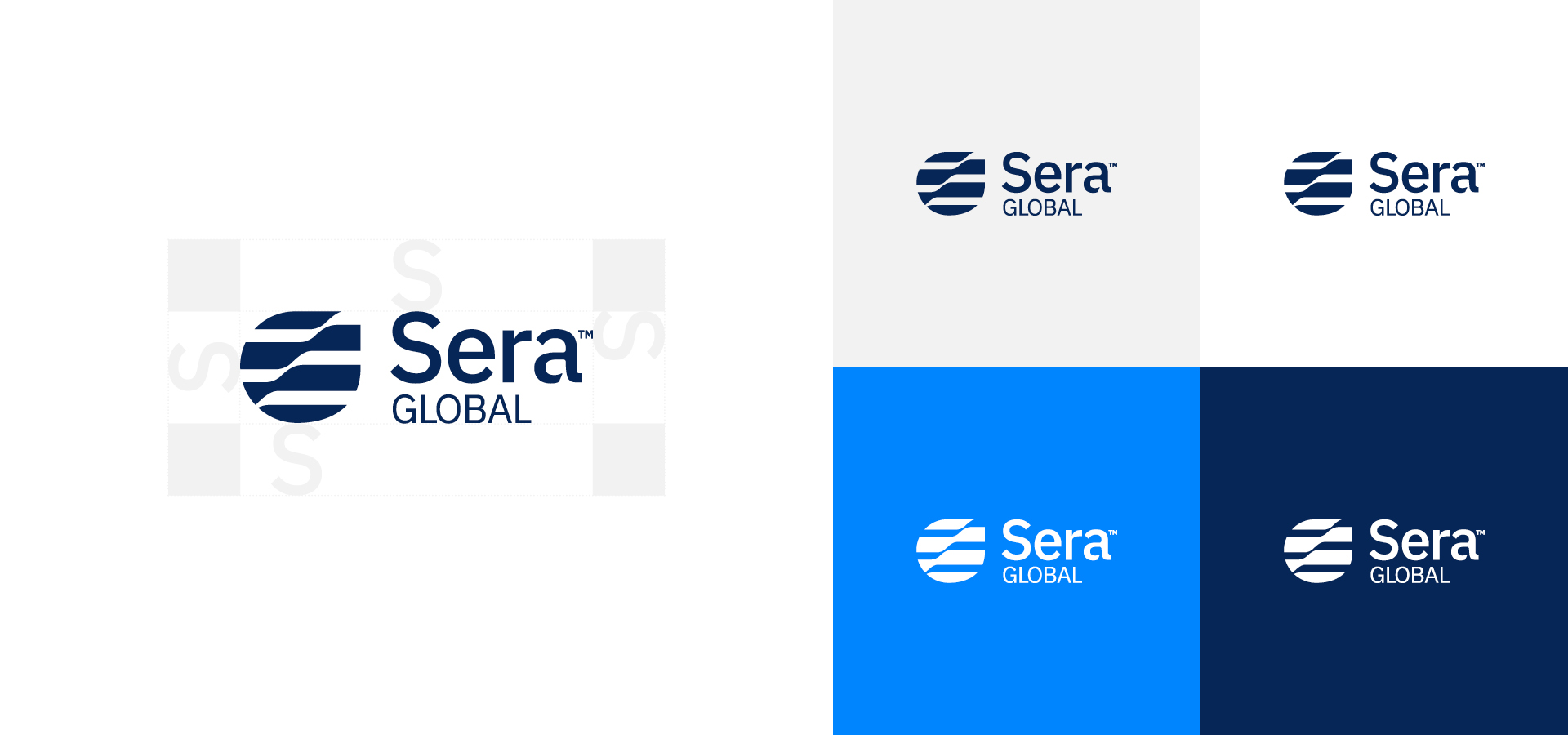
Additionally, as part of the refresh, we created a comprehensive brand manual for the team, detailing how to apply the new visual identity, including the use of the logo on the new primary and secondary colours.
Key deliverables:
Art direction
Brand guidelines
Report design
Branded materials
