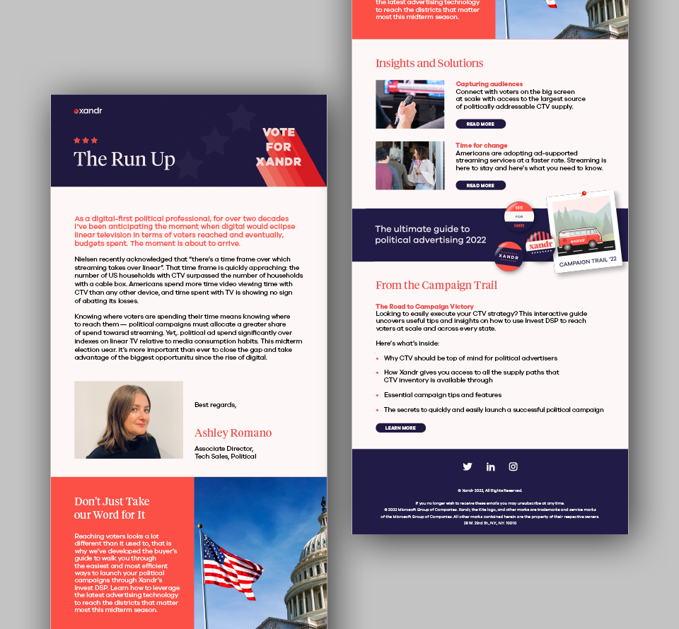
Xandr is the advertising and analytics subsidiary of Microsoft Corporation. We were asked to create a concept for a marketing campaign to position Xandr as the top AdTech platform – specifically for political advertising during a recent mid-term election year in the USA. The campaign would have multiple touchpoints including two microsites, animated videos, social media, newsletters and in-person events.
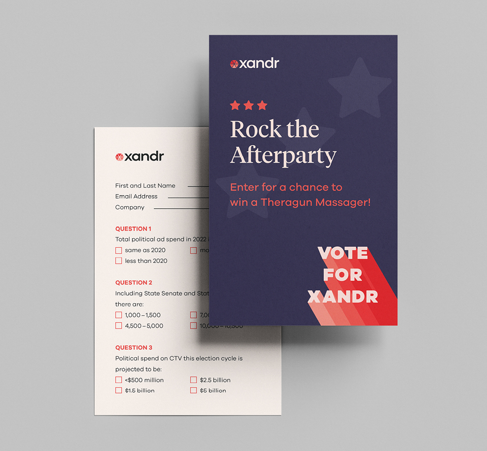
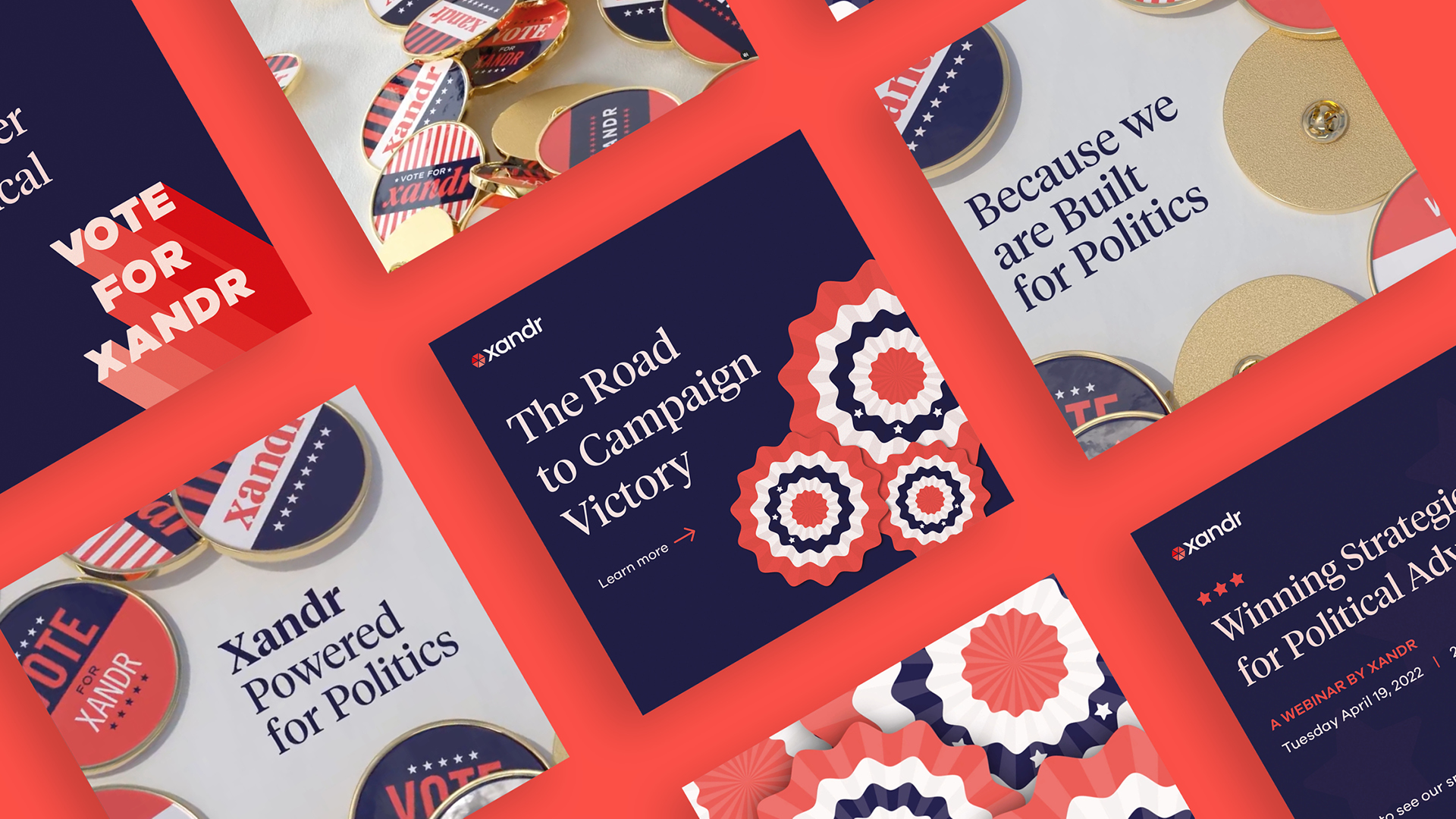
The client wanted a fun and playful identity to tie the campaign together while retaining a political feel. We drew inspiration from American political campaigns from the last 70 years, using a strong typographical approach to capture attention and suggest Xandr as the candidate, with the ‘Vote for Xandr’ tagline. The brand font was tweaked: the corners rounded to give a vintage feel and mimic the softer edges of older letterpress printing, while a grainy texture gave it a retro poster-like quality reminiscent of the mid-century. Stars from the American flag were used as graphic devices and campaign badges injected a fun element to the design.
The challenge
Part of the challenge of this project was political neutrality. We broke a bit with the client’s tradition and added in a navy-blue colour scheme that complemented and enhanced the corals in Xandr’s palette and balanced the design.
An additionally complex part of this project was creating an engaging interactive guide, which had been originally briefed in as a complex decision tree quiz. Taking inspiration from games such as Oregon Trail and Game of Life, we created an engaging way to educate users on best ways to build a political ad campaign.
Alongside these challenges, Xandr needed a design that was robust enough to span the entire year and that would be recognisable yet not grow tired as campaigns moved forward.
Our solution
The Xandr campaign built brand awareness and differentiation in the market through this engaging and impactful design. HB was able to combine strong typography, an illustration style and campaign badges to give it variety while maintaining a unified and cohesive feel. The campaign was well received by the client and the industry: it was a Gold Winner for the 2022 Muse Creative Awards in the Integrated Marketing Product Branding category. “The Political Hub” was recognised by Ceros, the platform on which it was built and came second in the Ceros 2022 Design Challenge. The two microsites garnered over 4,200 views and brought content to life through their use of interactive maps, an animated news ticker, a quiz, and the interactive game.
Key deliverables:
Campaign identity
Microsites
Interactive guide
Marketing materials
Paid Media ads


